
OBJECTIVE
My objective was to design a mobile-first wealth management experience for users who are financially aware but not financially confident, a growing segment in Indian markets, where financial app fragmentation is a well-documented pain point. I applied design thinking end-to-end, from research to a tested, high-fidelity prototype.
CONTEXT
WealthWise is a mobile-first fintech platform that consolidates mutual funds, stocks, FDs, PPF, and tax planning into one intelligent interface.
It was designed for financially aware users who lack confidence giving them a clear, real-time picture of their net worth and the contextual guidance to act on it.
DURATION
8 weeks
TOOLS
Figma, FigJam, Maze, Jira, Confluence
THE TEAM
Collaborated with a product manager, 1 engineer, and domain subject matter experts across research, ideation, and delivery phases.
MY ROLE
Senior UX Designer
View Final Prototype
THE CHALLENGE
Managing money feels overwhelming for most people.


These users aren't bad at managing money. They're simply working with tools that weren't designed to work together. Sifting through multiple apps, scattered notes, and endless browser tabs is overwhelming and leaves users with no true sense of their financial health. Most financial apps focus on displaying data, but users struggle to determine which actions to take.
How I narrowed in on the direction
🎯 Problem statement
User who want to invest struggle to get a clear, consolidated view of their wealth across fragmented apps and tools. They need an intelligent, unified platform that organises their investments, tracks goals, and provides contextual guidance, so they can make better financial decisions without the overwhelm.
Challenges in Ideation
I generated an influx of ideas to solve this problem, but quickly realized it would be impossible to tackle all in a 4-week sprint. I reworked the initial feature prioritization matrix and identified viable, feasible, and desirable objectives to focus on first.
A unified portfolio dashboard eliminates the fragmentation causing the most daily friction.
AI-powered nudges (SIP reminders, 80C deadlines, FD renewals) solve missed-deadline anxiety without being intrusive.
A goal-based investing flow turns abstract financial aspirations into concrete, trackable milestones.
USER RESEARCH
Uncovering pain points in the process
To gain genuine empathy, I interviewed 6 investors aged 22–34 years about their behaviours, motivations, and frustrations with managing personal wealth. I took a qualitative, open-ended research approach to maintain an exploratory nature and gain contextual understanding.
Guiding objectives
How do users currently track and manage their money?
What does "investing" mean to them emotionally?
What friction do users face today — and where do they give up?
Digging through the treasure chest
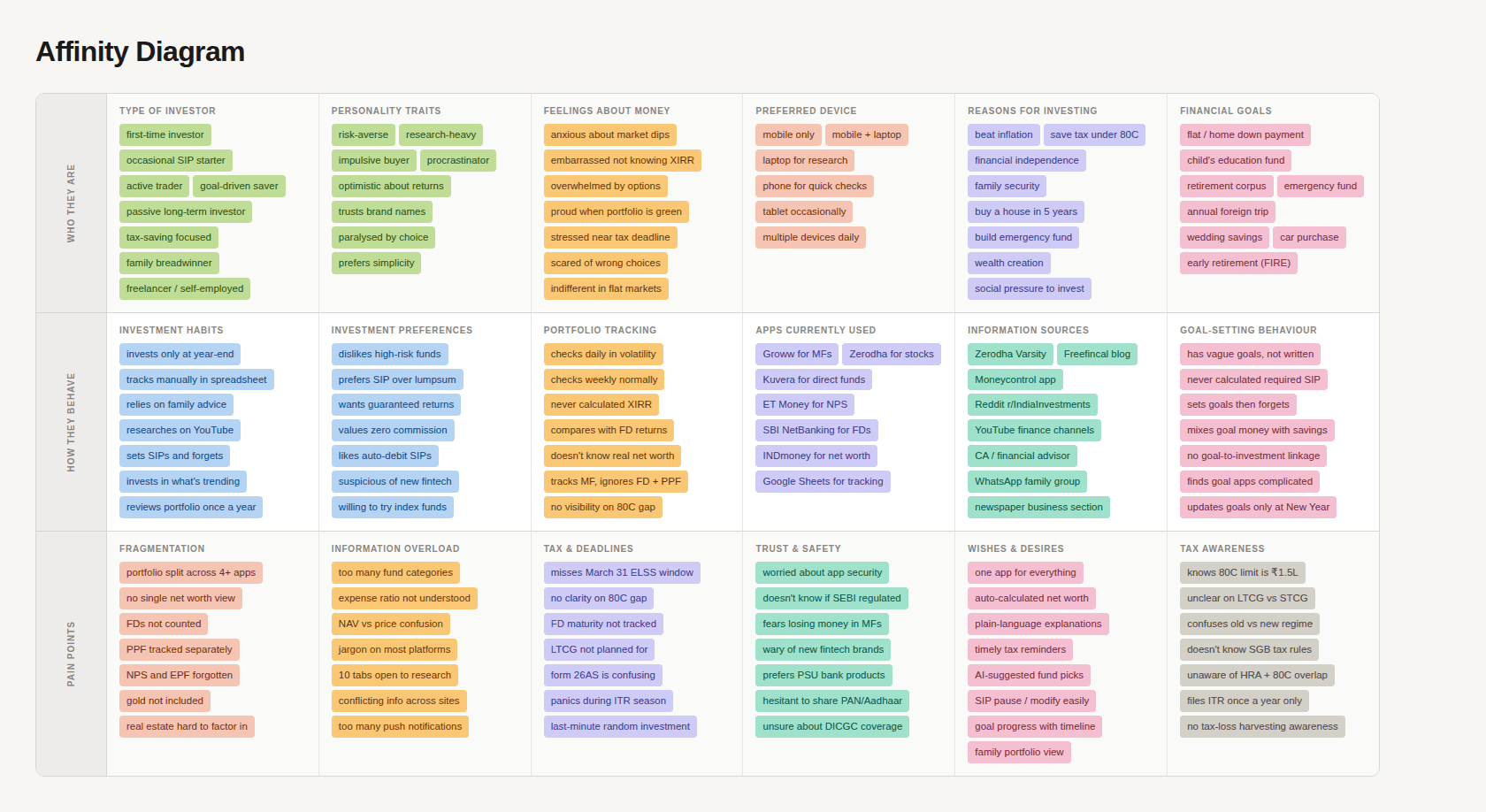
Using an affinity diagram, I grouped behavioural patterns and recurring themes. Three dominant pain points emerged across all participants:
⏳ Significant time and mental load
🫠 General feeling of financial disorganisation
🪫 Negative impact on financial outcomes
MARKET RESEARCH
Who are the competitors?
At this point, it was essential to evaluate platforms that might already fulfill the primary goals previously outlined. I identified four exceptional platforms that served as very close competitors, initially concerning me.

Stepping into their shoes
Using my research, I developed three user archetypes to frame the newfound problems in detail and build empathy for these target user segments.

Mapping the user journey
With a strong awareness of WealthWise's features, users, and competitors, I started defining the user journey which helped me visualize the steps and stages of the experience for the target user. This was all about tying it back to the user based on those archetypes.
USER FLOWS, SKETCHES & WIREFRAMES
Defining the core user flow for WealthWise
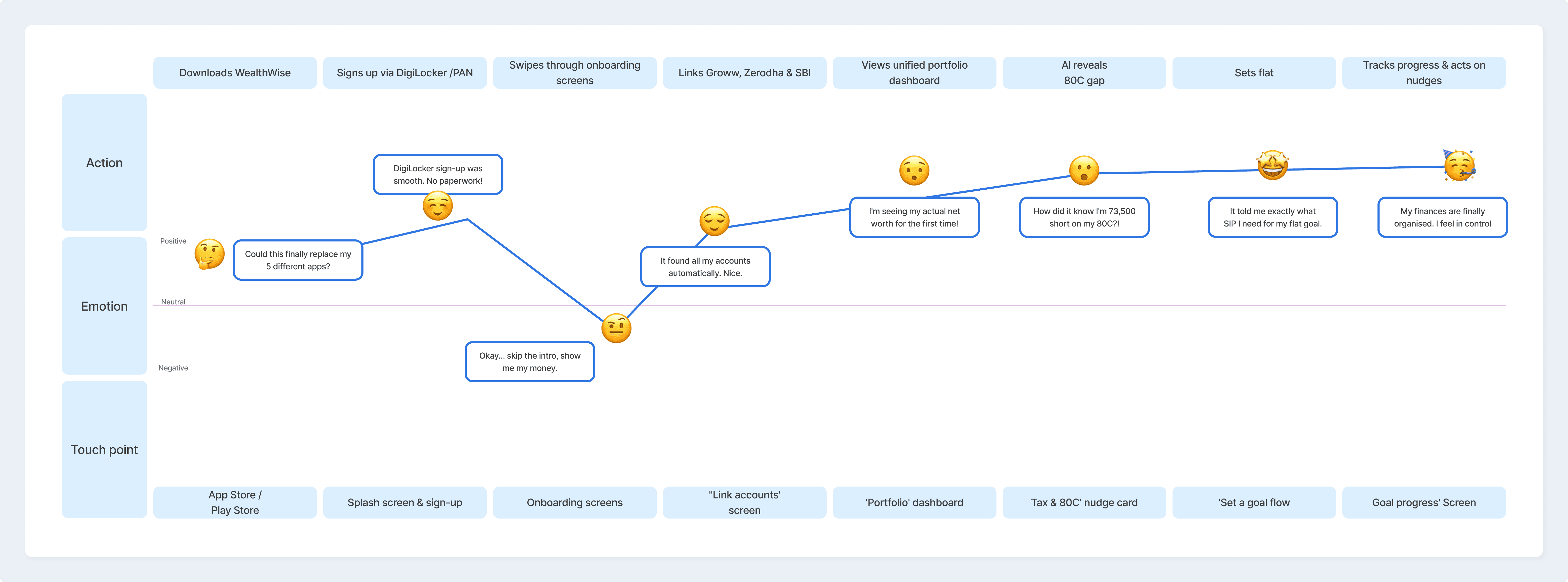
I established the core task flow for WealthWise's most critical journey: linking accounts and getting a unified portfolio view for the first time. The flow iterated multiple times based on usability testing but below is the final version.

WIREFRAMES
Iterating per testing observations
To see how successfully and quickly users could navigate through primary tasks, I iterated based on behavioral observations, voiced concerns, and designed best practices. Task Success Rate was 100% in all tests, but these qualitative insights drove each iteration.

HIGH FIDELITY DESIGNS
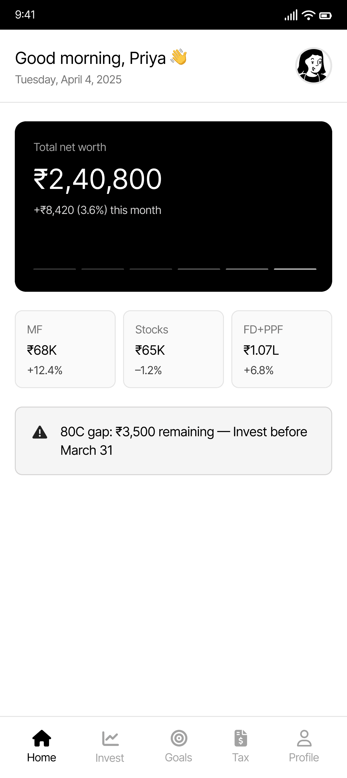
WealthWise's home dashboard consolidates net worth, asset breakdowns, AI-driven nudges, and quick actions into a single unified view, replacing the fragmented five-app experience users currently navigate daily. All screens were designed with WCAG AA standards in mind, mostly built within a structured design system of reusable components, colour tokens, and spacing rules to ensure consistency across all flows and scalability for future features.

USER TESTING AND ITERATIONS
Iterating per testing observations
I explored multiple directions:
Data-heavy dashboards → Rejected due to cognitive overload
Minimal summaries → Rejected due to lack of actionable insights
Final approach:
A guided, insight-driven experience that prioritizes what users should act on next while allowing deeper exploration when needed.
Four rounds of moderated usability testing were conducted with 5–6 participants per round. Design decisions were presented to stakeholders with explicit rationale at each stage before implementation. The iterations below represent the highest-impact changes driven by observed behaviour and tested assumptions.
SIP Summary
Users confirmed SIPs without seeing projected returns upfront, creating anxiety at the point of commitment
Pushed back on initial stakeholder preference for a condensed single-screen summary, testing data showed users needed the projected maturity value before confirming
Presenting outcomes before commitment increases transparency and builds trust, which is critical in financial decision-making.
Initial Version

Final Version

Dashboard
Constraints & Realities
Designing for financial experiences required balancing several constraints:
Data from multiple sources (PPF, ELSS, EPF) is fragmented and inconsistent
Regulatory sensitivity: avoiding misleading financial recommendations
High trust requirements: users must clearly understand outcomes
Need for scalability across multiple financial products
These constraints shaped decisions around simplicity, transparency, and progressive disclosure.
Initial version fragmented asset categories across separate screens with no unified net worth view
Proposed and defended a consolidated dashboard to the product manager, one card surfacing all linked account totals before any drill-down
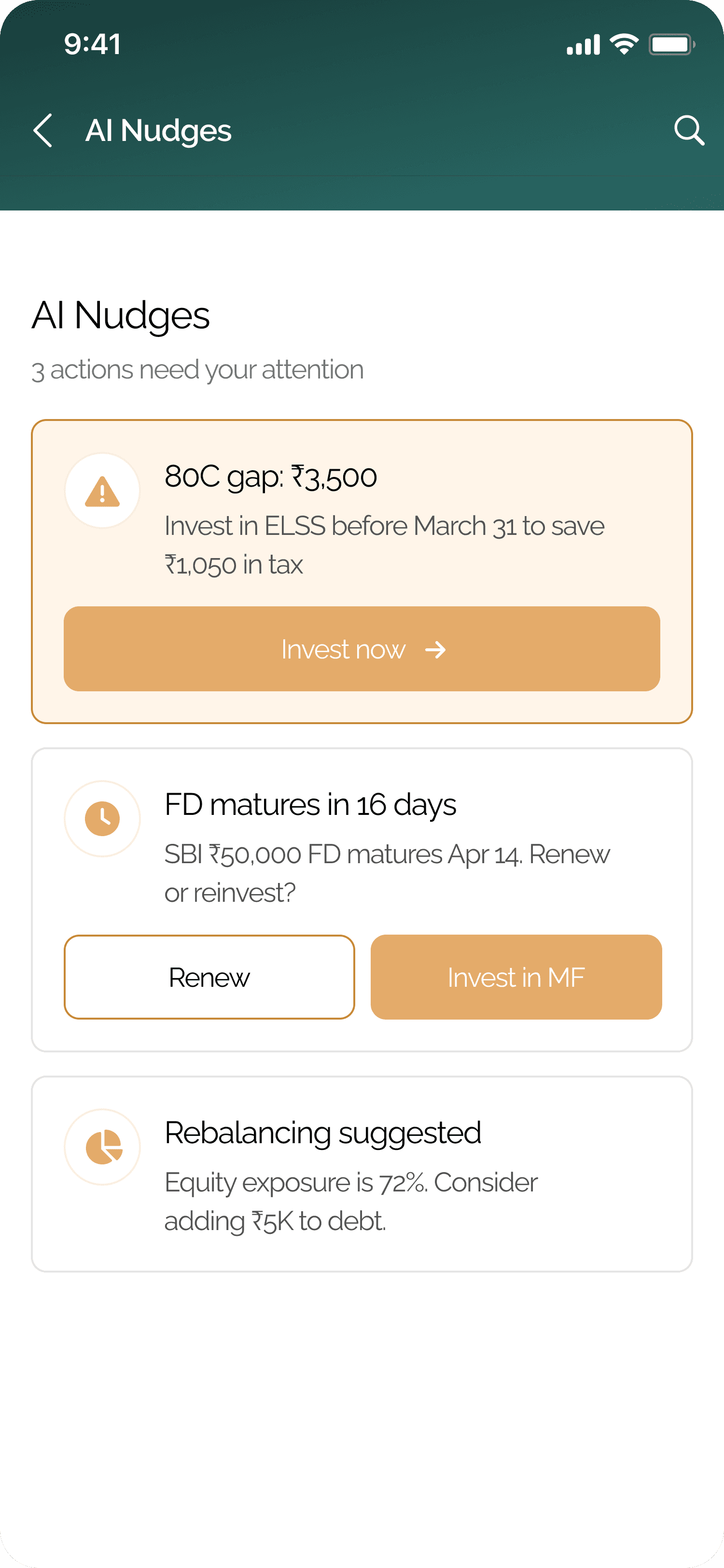
80C nudge is conditionally rendered, only shown when a gap exists and within 60 days of the March 31 deadline, reducing alert fatigue
Initial Version
Final Version

AI Nudges
Original design used a full-screen modal for the 80C alert — testing showed it increased app-close rate among 4 of 6 participants
Advocated for an inline contextual card with severity levels distinguished by border colour, icon shape, and background tint — not colour alone (WCAG 1.4.1)
Stakeholder alignment was required to reduce the nudge from a blocking modal to an ambient card — presented testing evidence to secure approval
This reduces the gap between awareness and action, especially in time-sensitive financial scenarios where delays can lead to missed opportunities.
Initial Version

Final Version
Stakeholder Alignment
Balancing Stakeholder Needs
Business goals required visibility of multiple financial features
Users needed simplicity and clarity
To balance this:
High-priority insights were surfaced first
Secondary information was progressively disclosed
This ensured usability without compromising business objectives.
Results and Impact
Original design used a full-screen modal for the 80C alert — testing showed it increased app-close rate among 4 of 6 participants
Advocated for an inline contextual card with severity levels distinguished by border colour, icon shape, and background tint — not colour alone (WCAG 1.4.1)
Task success rate: 100% across all tested flows. 4 rounds of moderated usability testing, 5–6 participants per round.
Stakeholder alignment was required to reduce the nudge from a blocking modal to an ambient card — presented testing evidence to secure approval
Future Considerations
Conversational AI layer to answer questions like "Am I on track for my goal?"
Family finance mode with shared goals and role-based portfolio access
Hindi and regional language support for Tier 2 and Tier 3 city investors
WCAG AAA compliance upgrade, error states, empty states, and offline behaviour
Analytics instrumentation to measure feature adoption and drop-off per flow
Developer handoff documentation with full annotation specs for all interaction states
What I Learnt
This project was a deliberate exercise in constraint — defining scope ruthlessly and designing for a user who is financially aware but not financially confident. The most important insight came late: the users I designed for weren't confused by investing, they were overwhelmed by the absence of a single place to see everything at once. That realization reshaped the entire information architecture.What I'd push further in a next iteration: the AI Nudges feature works as a push model, but the richer opportunity is conversational — letting users query their own financial picture rather than waiting to be reminded. That's the version of this product I'd want to build next.
Thank you for reading!
OBJECTIVE
My objective was to design a digital solution that helps everyday users take control of their financial future. I uncovered the prevailing needs of first-time investors and used research findings to design a wealth management app strategically. I practiced the design thinking process to innovate this user-centred experience.
CONTEXT
WealthWise is a mobile-first fintech platform that consolidates mutual funds, stocks, FDs, PPF, and tax planning into one intelligent interface.
It was designed for financially aware users who lack confidence giving them a clear, real-time picture of their net worth and the contextual guidance to act on it.
DURATION
8 Weeks
TOOLS
Figma, FigJam, Maze, Jira, Confluence
THE TEAM
Collaborated with a product manager, 1 engineer, and domain subject matter experts across research, ideation, and delivery phases.
MY ROLE
Product design
View Final Prototype
OBJECTIVE
My objective was to design a mobile-first financial management app that simplifies wealth-building for everyday users. I identified key gaps in how people interact with personal finance tools and used those insights to design an experience that makes investing, goal-setting, and portfolio tracking feel accessible.
I practiced the design thinking process to innovate this truly user-centered experience.
CONTEXT
WealthWise is a smart personal finance app built for people who want to take control of their money but don't know where to start. It helps users set financial goals, explore investment options, and track their portfolio — all in one place, without needing a financial advisor to translate the jargon.
DURATION
8 Weeks
TOOLS
Figma, FigJam
THE TEAM
Independent project
MY ROLE
Product design
View Final Prototype
USER RESEARCH
Uncovering pain points in the process
To gain genuine empathy, I interviewed 6 investors aged 22–34 yrs about their behaviours, motivations, and frustrations with managing personal wealth.
I took a qualitative, open-ended research approach in order to maintain an exploratory nature and gain contextual understanding.
Guiding objectives
How do users currently track and manage their money?
What does "investing" mean to them emotionally?
What friction do users face today — and where do they give up?

Digging through the treasure chest
Using an affinity diagram, I grouped behavioural patterns and recurring themes. Three dominant pain points emerged across all participants:
⏳ Significant time and mental load
🫠 General feeling of financial disorganisation
🪫 Negative impact on financial outcomes
USER RESEARCH
How I narrowed in on the direction
🎯 Problem statement
User who want to invest struggle to get a clear, consolidated view of their wealth across fragmented apps and tools. They need an intelligent, unified platform that organises their investments, tracks goals, and provides contextual guidance, so they can make better financial decisions without the overwhelm.
MARKET RESEARCH
Who are the competitors?
At this point, it was essential to evaluate platforms that might already fulfill the primary goals previously outlined. I identified four exceptional platforms that served as very close competitors, initially concerning me.
MARKET RESEARCH
Who are the competitors?
At this point, it was essential to evaluate platforms that might already fulfill the primary goals previously outlined. I identified three exceptional platforms that served as very close competitors, initially concerning me.
Stepping into their shoes, once again!
With a strong awareness of WealthWise's features, users, and competitors, I started defining the user journey, which helped me visualize the steps and stages of the experience for the target user. This was all about tying it back to the user based on those archetypes.
Stepping into their shoes, once again!
With a strong awareness of WealthWise's features, users, and competitors, I started defining the user journey which helped me visualize the steps and stages of the experience for the target user. This was all about tying it back to the user based on those archetypes.
USER FLOWS, SKETCHES & WIREFRAMES
Defining the experience for creating an itinerary
I established the core task flow for WealthWise's most critical journey: linking accounts and getting a unified portfolio view for the first time. The flow iterated multiple times based on usability testing but below is the final version.
Stepping into their shoes
Using my research, I developed three user archetypes to frame the newfound problems in detail and build empathy for these target user segments.
Stepping into their shoes
Using my research, I developed three user archetypes to frame the newfound problems in detail and build empathy for these target user segments.
WIREFRAMES
Iterating per testing observations
To see how successfully and quickly users could navigate through primary tasks, I iterated based on behavioral observations, voiced concerns, and designed best practices. Task Success Rate was 100% in all tests, but these qualitative insights drove each iteration.
HIGH FIDELITY DESIGNS
WealthWise's home dashboard consolidates net worth, asset breakdowns, AI-driven nudges, and quick actions into a single unified view, replacing the fragmented five-app experience users currently navigate daily. All screens were designed with WCAG AA standards in mind, mostly built within a structured design system of reusable components, colour tokens, and spacing rules to ensure consistency across all flows and scalability for future features.
USER TESTING AND ITERATIONS
Iterating per testing observations
Four rounds of moderated usability testing were conducted with 5–6 participants per round. Design decisions were presented to stakeholders with explicit rationale at each stage before implementation. The iterations below represent the highest-impact changes driven by observed behaviour and tested assumptions.
I explored multiple directions:
Data-heavy dashboards → Rejected due to cognitive overload
Minimal summaries → Rejected due to lack of actionable insights
Final approach:
A guided, insight-driven experience that prioritizes what users should act on next while allowing deeper exploration when needed.
SIP Summary
Users confirmed SIPs without seeing projected returns upfront, creating anxiety at the point of commitment
Pushed back on initial stakeholder preference for a condensed single-screen summary, testing data showed users needed the projected maturity value before confirming
Initial Version
Final Version
Dashboard
Initial version fragmented asset categories across separate screens with no unified net worth view
Proposed and defended a consolidated dashboard to the product manager, one card surfacing all linked account totals before any drill-down
80C nudge is conditionally rendered, only shown when a gap exists and within 60 days of the March 31 deadline, reducing alert fatigue
Constraints & Realities
Designing for financial experiences required balancing several constraints:
Data from multiple sources (PPF, ELSS, EPF) is fragmented and inconsistent
Regulatory sensitivity: avoiding misleading financial recommendations
High trust requirements: users must clearly understand outcomes
Need for scalability across multiple financial products
These constraints shaped decisions around simplicity, transparency, and progressive disclosure.
Initial Version
Final Version
AI Nudges
Original design used a full-screen modal for the 80C alert — testing showed it increased app-close rate among 4 of 6 participants
Advocated for an inline contextual card with severity levels distinguished by border colour, icon shape, and background tint — not colour alone (WCAG 1.4.1)
Stakeholder alignment was required to reduce the nudge from a blocking modal to an ambient card — presented testing evidence to secure approval
Initial Version
Final Version
Results and Impact
Original design used a full-screen modal for the 80C alert — testing showed it increased app-close rate among 4 of 6 participants
Advocated for an inline contextual card with severity levels distinguished by border colour, icon shape, and background tint — not colour alone (WCAG 1.4.1)
Stakeholder alignment was required to reduce the nudge from a blocking modal to an ambient card — presented testing evidence to secure approval
Future Considerations
Conversational AI layer to answer questions like "Am I on track for my goal?"
Family finance mode with shared goals and role-based portfolio access
Hindi and regional language support for Tier 2 and Tier 3 city investors
WCAG AAA compliance upgrade, error states, empty states, and offline behaviour
Analytics instrumentation to measure feature adoption and drop-off per flow
Developer handoff documentation with full annotation specs for all interaction states
What I Learnt
Financial anxiety is a fragmentation problem, not a knowledge problem, the design solution had to be architectural before it could be visual.
Stakeholder alignment in regulated product contexts requires evidence, not just opinion; every major decision was presented with testing data before implementation.
Designing within constraints (accessibility standards, component systems, and financial regulations) produces better outcomes than designing without them.
The most impactful change in each iteration was not visual; it was structural: when information appeared, in what order, and under what conditions.
Progressive disclosure is not just a UX pattern; in financial products, showing the right information at the right moment is a trust-and-safety principle.
Stakeholder Alignment
Balancing Stakeholder Needs
Business goals required visibility of multiple financial features
Users needed simplicity and clarity
To balance this:
High-priority insights were surfaced first
Secondary information was progressively disclosed
This ensured usability without compromising business objectives.
HIGH FIDELITY DESIGNS
WealthWise's home dashboard consolidates net worth, asset breakdowns, AI-driven nudges, and quick actions into a single unified view — replacing the fragmented five-app experience users currently navigate daily.
USER TESTING AND ITERATIONS
Iterating per testing observations
Two rounds of user testing involving 4 participants were conducted following the wireframing and prototyping phases.
I explored multiple directions:
Data-heavy dashboards → Rejected due to cognitive overload
Minimal summaries → Rejected due to lack of actionable insights
Final approach:
A guided, insight-driven experience that prioritizes what users should act on next while allowing deeper exploration when needed.
SIP Summary
Users confirmed SIPs without seeing projected returns or total gains upfront
Starting a new SIP selection happened on a separate screen after confirmation
Summaries did not give the entire required information
Initial Version
Final Version
Dashboard
Unified net worth card shows ₹10,80,000 aggregated across all linked accounts
Asset chips (MF / FD+PPF / AI Nudges) give a category-level view in one tap
80C gap nudge surfaces contextually — only when relevant, with a direct action path
Constraints & Realities
Designing for financial experiences required balancing several constraints:
Data from multiple sources (PPF, ELSS, EPF) is fragmented and inconsistent
Regulatory sensitivity: avoiding misleading financial recommendations
High trust requirements: users must clearly understand outcomes
Need for scalability across multiple financial products
These constraints shaped decisions around simplicity, transparency, and progressive disclosure.
Initial Version
Final Version
AI Nudges
All nudges consolidated in one screen with 3 severity-ranked action cards
Each nudge carries a specific CTA — "Invest now", "Renew", "Invest in MF"
Amber tint + warning icon encodes urgency without relying on colour alone
Initial Version
Final Version
Results and Impact
To see how successfully and quickly users could navigate through primary tasks, I iterated based on behavioral observations, voiced concerns, and designed best practices. Task Success Rate was 100% in all tests, but these qualitative insights drove each iteration.
Future Considerations
Conversational AI layer to answer questions like "Am I on track for my goal?"
Family finance mode with shared goals and role-based portfolio access
Hindi and regional language support for Tier 2 and Tier 3 city investors
Full WCAG AAA compliance, error states, empty states, and offline behaviour
What I Learnt
This project allowed me to practice the UX process for the first time and learn from my mistakes along the way. Although I hardly scratched the surface, I feel that I learned so much about UX/UI and grew tremendously as a designer. I found joy in the science of research and testing and leveraged my passion for communication to translate user problems into intentional, actionable solutions. There is always room for improvement, but feedback during testing about the usability of WealthWise was overwhelmingly positive. I learned to scrap designs for improved iterations, something I initially found challenging coming from a detail-oriented, visual design background. I am proud of the solution I created and, as always, am eager to grow and learn more.
Stakeholder Alignment
Balancing Stakeholder Needs
Business goals required visibility of multiple financial features
Users needed simplicity and clarity
To balance this:
High-priority insights were surfaced first
Secondary information was progressively disclosed
This ensured usability without compromising business objectives.