
To design an internal billing and reconciliation system to help financial teams identify discrepancies, reduce manual effort, and improve accuracy in high-volume workflows. Focus on simplifying complex data views and enabling faster decision-making. Improve usability while working within enterprise constraints like large datasets and compliance requirements.
Finance teams were reconciling invoices manually, cross-referencing spreadsheets, chasing approvals over email, and catching discrepancies only at month-end. Every error introduces audit risk. Every delay extended the close cycles.
10 weeks
Figma, FigJam, Maze, Jira, Confluence
2 Devs · PM · Finance SME · Legal
Senior UX Designer
Skills
Led user research through competitive analysis, persona development, and usability testing planning.
Created wireframes, mid- and high-fidelity prototypes, and interactive design concepts to communicate design direction.
Developed and refined designs through iterative feedback and close collaboration with cross-functional teams.
01
The problem
Financial teams struggled to reconcile transactions due to fragmented data, unclear status visibility, and manual verification steps.
This led to delays, increased cognitive load, and a higher risk of reconciliation errors. The system needed to support fast, accurate decision-making in a high-stakes financial environment.
02
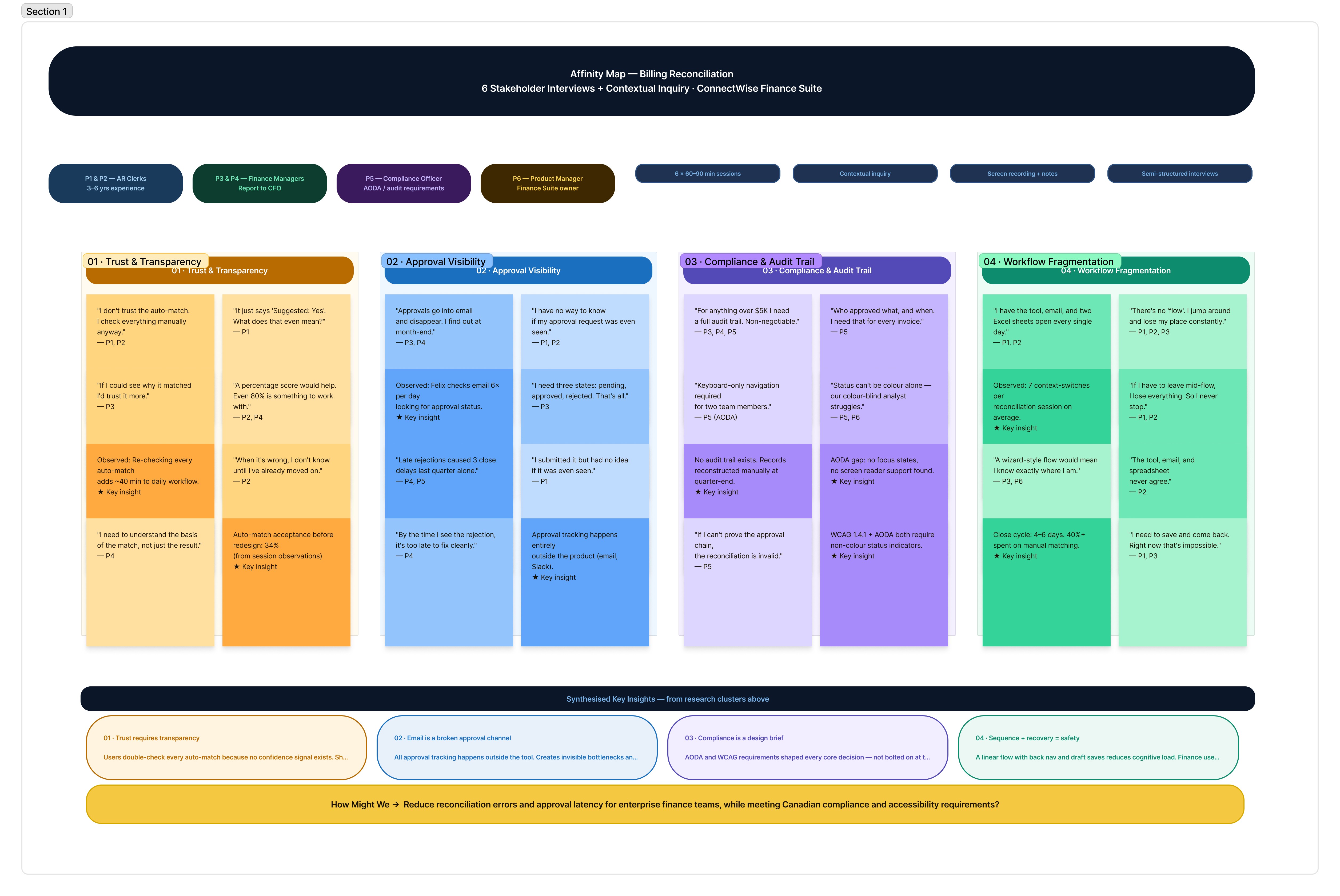
User Research
Conducted 6 stakeholder interviews (finance managers, clerks, a compliance officer) + competitive analysis of enterprise billing tools.
Key method: contextual inquiry, observed live reconciliation sessions to capture workarounds.


03
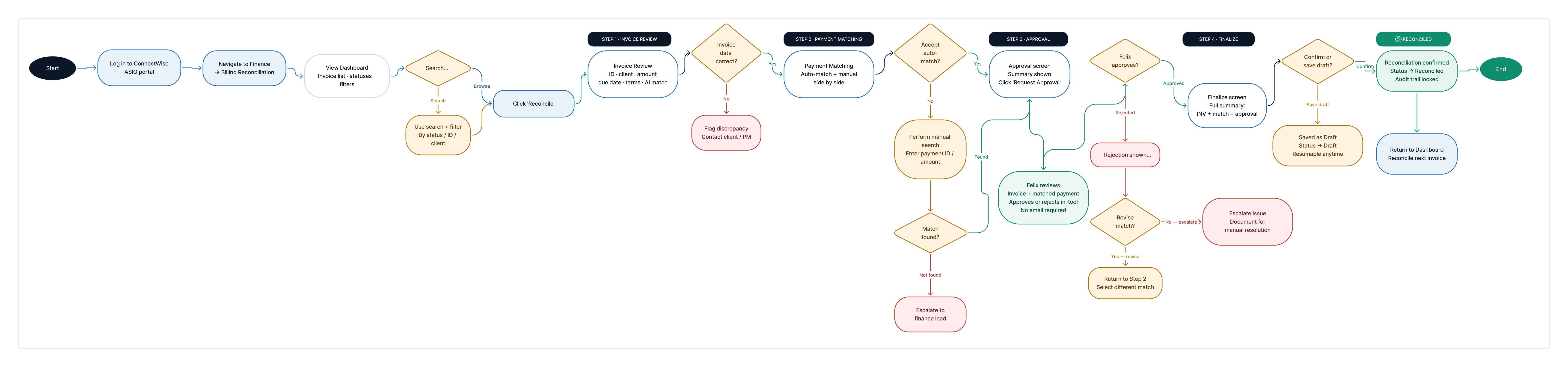
User Flow and Affinity Map
Simplified the workflow into sequential, recoverable stages. Each stage has a clear entry/exit state, preventing mid-flow confusion and creating a full audit trail per invoice.
Trade-offs & Decisions
Balanced data density with readability by grouping related information instead of showing everything at once
Simplified workflows while ensuring compliance requirements were still met
Prioritized critical actions over secondary features to reduce decision fatigue
View Affinity Map
04
Wireframes & Key Screens
Progressed from mid-fi flows (validated with stakeholders in sprint reviews) → high-fidelity screens. Key screens annotated with interaction rationale for dev handoff. High-fidelity screens are protected under NDA. The wireframes below — annotated with interaction rationale — represent the full decision-making layer of this project. For a walkthrough of the high-fidelity work, I'm happy to present it in a portfolio review.

View Wireframes
05
Key Design Decisions
06
Compliance & Accessibility
07
Stakeholder Alignment
Stakeholders required visibility into multiple financial metrics, while users needed clarity and simplicity. To balance this, high-priority insights were surfaced first, with secondary data progressively disclosed. This ensured usability without compromising business and compliance requirements.
08
Result and Impact
Reduced time to identify reconciliation issues
Improved accuracy by making system status and data relationships clearer
Reduced cognitive load through structured workflows and prioritization
Increased efficiency for teams handling high-volume financial data
Key outcomes post-launch:
62% reduction in time-to-reconcile per invoice
Zero approval-related close delays, down from 3–4 per cycle, 100% WCAG 2.1 AA pass rate
Compliance requirement met and validated with 6 finance users across 2 rounds of moderated usability testing
09
Future Considerations
The current flow solves for a single user. The data model was built to support a team-level manager view, all in-flight reconciliations, and approval bottlenecks surfaced at a glance — but it was scoped out of v1 to keep the release focused.
Highest-priority next features:
Advanced filtering and search for large datasets
Role-based dashboards for different financial user groups
Audit trail visibility for compliance and tracking
Analytics to monitor workflow efficiency and drop-offs
10
What I learnt
Watching users interact with auto-match taught me that transparency is the feature, not a nice-to-have. A 95% confidence score meant nothing without showing what it was based on. 4 participants dismissed it as noise until the rationale was visible.
Compliance requirements are design inputs, not constraints. Reframing the audit trail requirement as the brief, rather than designing around it, made every subsequent decision clearer and faster.