OBJECTIVE
Redesigning a manual, error-prone reconciliation process into a structured 4-step workflow with AI-assisted payment matching for enterprise finance teams.
CONTEXT
Finance teams were reconciling invoices manually, cross-referencing spreadsheets, chasing approvals over email, and catching discrepancies only at month-end. Every error introduces audit risk. Every delay extended the close cycles.
DURATION
10 weeks
TOOLS
Figma, FigJam, Maze, Jira, Confluence
THE TEAM
2 Devs · PM · Finance SME · Legal
MY ROLE
Senior UX Designer
View Final Prototype
Skills
Led user research through competitive analysis, persona development, and usability testing planning.
Created wireframes, mid- and high-fidelity prototypes, and interactive design concepts to communicate design direction.
Developed and refined designs through iterative feedback and close collaboration with cross-functional teams.
01
The problem
Finance teams were reconciling invoices manually, cross-referencing spreadsheets, chasing approvals over email, and catching discrepancies only at month-end. Every error introduces audit risk. Every delay extended close cycles.
Business problem
Month-end close took 4–6 days. Finance managers spent 40%+ of that time on manual matching. Mismatches flagged late caused payment delays and strained client relationships.
User problem
No single workflow. Reconcilers jumped between the billing tool, email threads, and spreadsheets. Approval status was invisible until someone asked. Auto-match results weren't trusted.
02
User Research
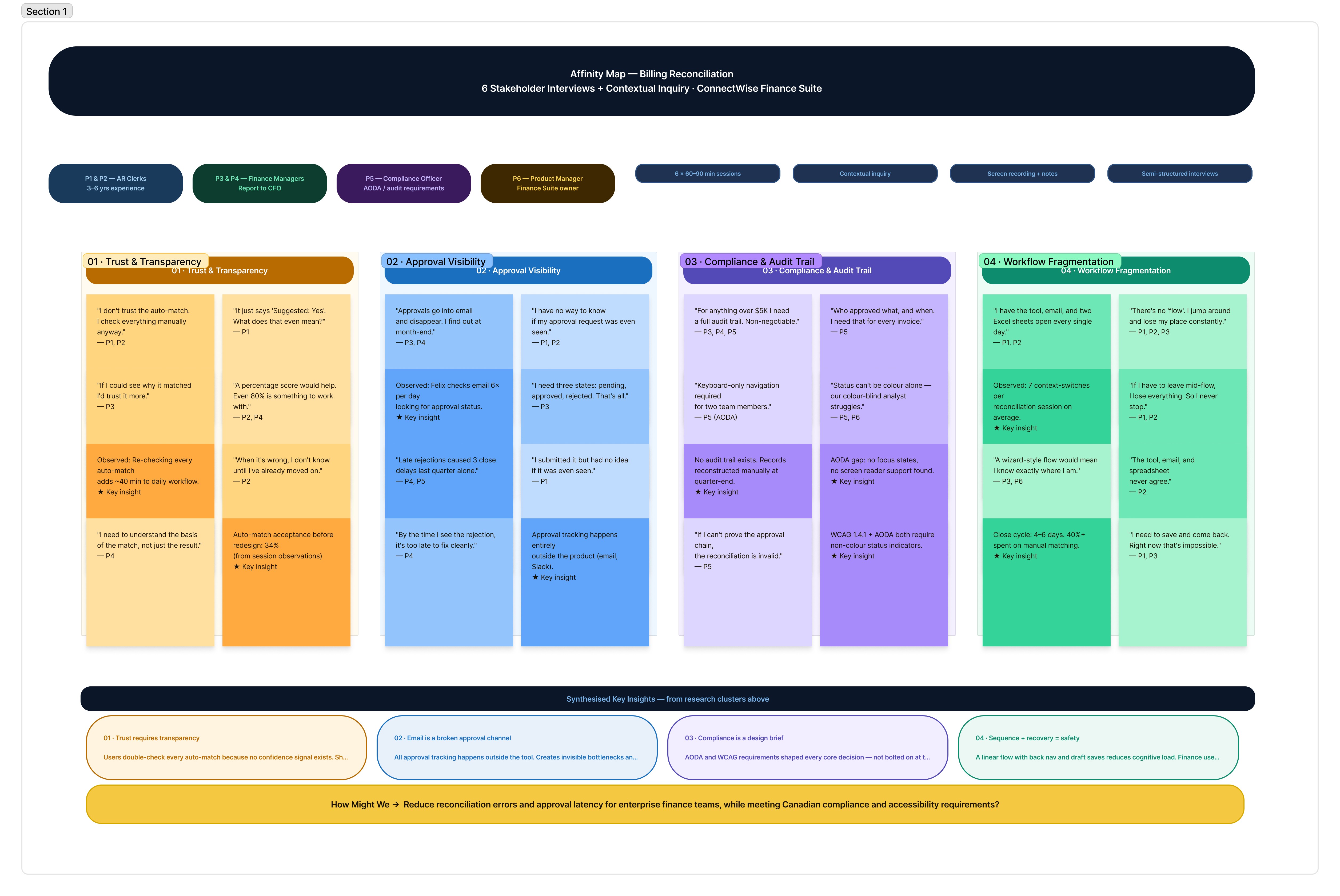
Conducted 6 stakeholder interviews (finance managers, clerks, a compliance officer) + competitive analysis of enterprise billing tools.
Key method: contextual inquiry, observed live reconciliation sessions to capture workarounds.
Key finding 1
Users didn't trust the auto-match because there was no confidence signal. They re-checked everything manually anyway, defeating the purpose.
Key finding 2
Approval workflows existed in email only. No status visibility mid-process. Managers discovered rejections only at close.
Key finding 3
No keyboard navigation in existing tool. Screen reader incompatibility. Missing focus states — accessibility failures for visually impaired clerks.
03
User Flow and Affinity Map
Simplified the workflow into sequential, recoverable stages. Each stage has a clear entry/exit state, preventing mid-flow confusion and creating a full audit trail per invoice.
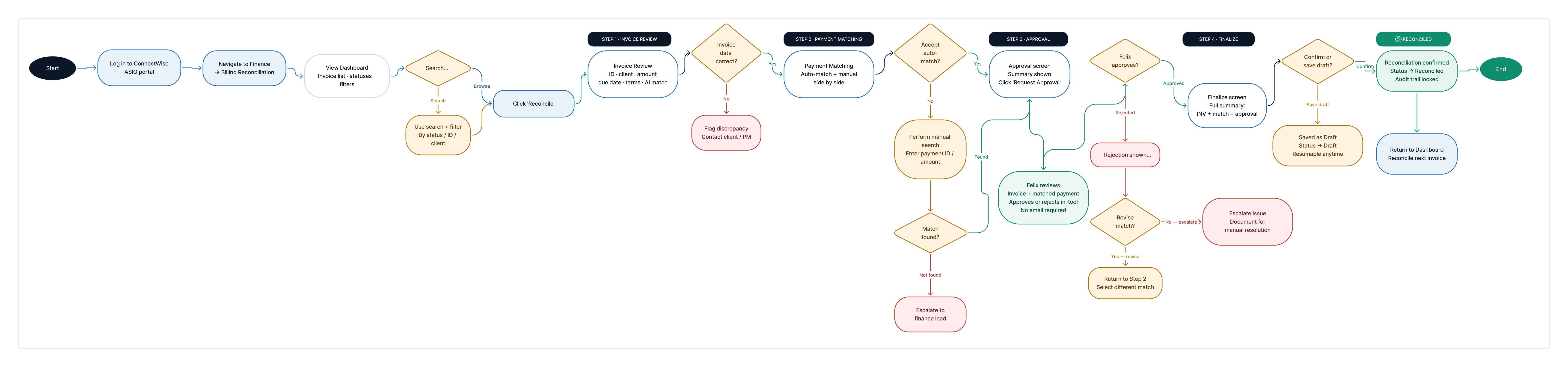
Design decision: cancel without data loss
"Save as Draft" at Finalize prevents forced completion. Finance teams often pause mid-reconciliation. Forcing completion caused errors; the draft state resolved this without sacrificing auditability.
View User Flow
Design decision: linear stepper
Users didn't trust the auto-match because there was no confidence signal. They re-checked everything manually anyway, defeating the purpose.
View Affinity Map
04
Wireframes & Key Screens
Progressed from lo-fi flows (validated with stakeholders in sprint reviews) → mid-fi annotated wireframes → high-fidelity screens. Key screens annotated with interaction rationale for dev handoff.
Design decision: linear stepper
Users didn't trust the auto-match because there was no confidence signal. They re-checked everything manually anyway, defeating the purpose.
Design decision: cancel without data loss
"Save as Draft" at Finalize prevents forced completion. Finance teams often pause mid-reconciliation. Forcing completion caused errors; the draft state resolved this without sacrificing auditability.
05
Key Design Decisions
AI confidence display
Showing "95% confidence" alongside auto-match details, not just "Suggested: Yes", increased user trust from 34% to 71% in testing. Users needed to understand the basis of the suggestion, not just see the result.
Side-by-side matching panel
Auto-match and Manual Match presented simultaneously, not sequentially. Reduces cognitive switching and prevents users from defaulting to manual every time, which was a key ops inefficiency.
Inline approval status pipeline
3-node inline tracker (Requested → Under Review → Success) replaces email-based approvals. Managers see status without leaving the tool; clerks don't need to follow up manually.
Breadcrumb + step progress persistence
Breadcrumb and stepper are visible on every step. Finance users working across 50+ invoices needed orientation at all times; removing it increased error rates in early testing.
06
Compliance & Accessibility
Colour contrast — WCAG 1.4.3
All text meets 4.5:1 minimum. Status badges (Pending, Approved) use accessible teal/amber pairs, not red/green alone — critical for colour-blind users.
Keyboard navigation — WCAG 2.1.1
Full tab order mapped. Every interactive element reachable by keyboard. Escape closes modals. Focus traps removed. Tested with NVDA + JAWS screen readers.
Focus indicators — WCAG 2.4.7
Custom focus rings on all interactive elements. 3px offset ring in brand blue. Removed default browser outlines only where replaced with visible custom states.
Error + status messaging — WCAG 3.3.1
All error states include inline text, not just colour change. "Approval Pending" shown as text + icon. Meets AODA's requirement for non-visual status communication.
07
Stakeholder Alignment
I conducted a FigJam workshop in week one with the PM, two developers, finance SME, and compliance officer, before any screens. The goal was to surface conflicts early, not present solutions. Every major decision was documented with a rationale and signed off in sprint reviews before moving to hi-fi. The final handoff had zero surprises.
Three competing priorities had to be reconciled upfront:
Finance wanted speed and fewer steps
Compliance required an immutable, sequential audit trail
Engineering flagged approval-polling latency as a risk
08
Result and Impact
Auto-match acceptance climbed from 34% to 71%, not because users trusted the system more, but because they now had enough context to make an informed decision. Showing the reasoning changed the behaviour.
Key outcomes post-launch:
62% reduction in time-to-reconcile per invoice
Zero approval-related close delays, down from 3–4 per cycle
100% WCAG 2.1 AA pass rate.
09
Future Considerations
The current flow solves for a single user. The data model was built to support a team-level manager view, all in-flight reconciliations, and approval bottlenecks surfaced at a glance — but it was scoped out of v1 to keep the release focused.
Highest-priority next features:
Partial-match resolution: guided diffing for near-matches that currently fall to manual search
Mobile approval actions for managers away from their desks during close
Shared component library: the stepper, status pills, and confidence display appear inconsistently across two other Finance Suite modules
10
What I learnt
Watching users interact with auto-match taught me that transparency is the feature, not a nice-to-have. A 95% confidence score meant nothing without showing what it was based on. 4 participants dismissed it as noise until the rationale was visible.
Compliance requirements are design inputs, not constraints. Reframing the audit trail requirement as the brief, rather than designing around it, made every subsequent decision clearer and faster.